Wednesday, October 31, 2007

Color Strategy

"Apple Pie Slice", Oil on Panel, 6x6 inches
Jerry Lebo, 2007


My wife baked an apple pie last week from scratch—and I stole the last slice from the fridge (she thinks I ate it) and I put it up on the still life stand. As I was painting, I noticed this nice purple-yellow complementarity emerging between the pie and the background, so I pushed it a bit. I think it gives the painting a nice calm feeling, sort of like the feeling after you eat apple pie. Anyway, I hope you like it. If you want to add it to your collection of Jerry Lebo paintings—or start one—you can click here to bid for it on Ebay.

Also, as I promised last week, I have also added a link trading system on the bottom right of my blog—and put a few other blogs who are linked into Sixty Minute Artist. So, if you want to trade links, send me an email with your link and I will post it—assuming you are linked back to my blog and have an art-related blog. I really wanted this to be an automated process—but after taking a look at all the various widgets out there—none of them really seemed to fit the bill. Thus, it looks like I will have to do it manually for a while.

I have been meaning to do a posting on color and painting—and was reading a post titled “Color Theory” over at Skating on the Edge of Infinity—which links through to another blog called All the Strange Hours (ATSHs). David over at ATSHs—has written an over twenty page treatise titled “Color and Color Mixing”. This is one of the best pieces of writing on color I have read in a long time. I highly recommend you go over and read it. There are a lot of small tidbits worth writing on the wall of your studio. Such as, “value is the most important component of color”, “mix the value first”, and about how to nudge color—or as Scott Christensen says, “bend”. These are principles I have been talking about in my own blog, and I thus I highly recommend you go and read this piece. Print it out and post it in the studio. Thanks ATSHs.

In this post, I want to take the ideas ATSHs has put forth and add some practical advice. Over the years, I have probably read most of the books on color theory, color mixing, and color for artists out on the market—and I find them frustrating to read. Why? They spend a lot of time telling you about complements, how to mix a color, or how to “make color sing”, and then leave you staring at a blank canvas wondering what color to mix first. Painting is not about reacting to a book, it is about reacting to the thing you are trying to paint. Okay, sure, you need to know what complements are, and how to mix purple, for example—but what you really need to know in particular situation is how to respond to the thing in front of you so that you are able to use the colors on your palette effectively. What I am trying to say, is that all these books on color harmony and color theory aren’t worth much for one simple reason; they don’t give you a practical strategy for using color. Painting is not about color theory, but about taking a set of colors sitting on your palette, a blank canvas, and using these to communicate to the viewer.

Before I start into my ramblings on “color strategy”, let me start by mentioning a related issue—palette. Most artists eventually settle not only on a set of colors to put on their palette, but a set of color mixes they use to communicate. My friend Mitchell told me what one his teachers at Parsons School of Design used to say about Corot, “those were his colors”. What they meant is that, while all those browns and grays Corot used may appear to us to be rather bland, they were in fact the mature palette which he developed to communicate in his landscape paintings—and in that sense became “his colors”. He did not jump all over the place—one day adding a bright orange, green the next. He found a set that worked for him. They became so personal, that if you paint a painting using those colors, someone will inevitably think you are imitating Corot—or will say it feels like a Corot. In other words, the sensation communicated through that set of color harmonies, and various values and compositions, have become associated with Corot. I think the same can be said for Cezanne, Monet, Gauguin, etc. Even modern painters, such a Thiebaud, Indiana, or De Kooning, have developed “their own colors”.

I wanted to tell you this story so that you understand that eventually you will find (and need to find) a set of colors and color mixes that allow you to communicate in the way that is unique to you—and there is not much anybody can do to help you find these colors. It is simply a very personal process that will evolve over your lifetime. I can say, however, that the best way to find these colors is to paint—and paint often. Look at other paintings you like and try to see if you can reproduce the sensation of those paintings. Play around. I did a post a while back on how to “steal color harmonies” which is one way to try out different color ideas. In any case, “your colors” will come to you over time, and after painting many, many paintings. I have been painting for twenty years, and my colors are still moving around a bit—although my palette does not change very much.

Okay, back to the idea of a color strategy. To me, painting is a very practical problem. You have some colors on the palette, you have a blank canvas, and you want to make something interesting that will communicate to the viewer. The problem is that the possible combinations are limitless, and there is no structure to guide you. Also, if you handle paint badly, it will turn into a mess. That is where the practical problem of painting begins to seem impossible. One approach is to look at how other people have solved this problem—which I think is a good idea. You should definately go to museums, look at paintings, copy paintings (rent a DVD)—and thus learn from other artists who have solved this problem. But, that will only take you so far. You will eventually need to find your own solution, not copy theirs. And that is what all those books on color theory and harmony fail to tell you--where and how to start finding your own approach!
So let me give you some fundamentals—a practical approach to getting started and, hopefully, finishing a successful painting—as well as to start developing your own color strategy. What I am about to recommend is mainly aimed at the beginning and intermediate painter--my apologies for those who find it too simplistic. I also want to state upfront that this is not the only way to paint; there are obviously millions of ways to go about it. What I am going to present is based on what I have seen a large number of successful artists doing—in essence, a composite approach to using color:

1. Pick a “drawing” color. Most artist start with a drawing of some sort. Not a detailed drawing, but a loose sketch laying out the major shapes and composition. I recommend you do this with a warm color, since subsequent over-painting is either going to pick up this color--and thus warm whatever color you are applying--or let it show through. If the color is too cool, it will tend to deaden the painting. Of course, you can try a variety of colors and find what works best for you--I recommend a warm mid-tone. In any case, this color, what I call the “drawing color” will slowly become a stable part of your process—and will become the way you start all your paintings—so don’t change it every time once you have something that works for you. Personally, I nearly always start my paintings with a roughly equal mixture of Sap Green and Cadmium Red. I have seen other Artists use straight Cadmium Red—which is not only warm, but around the middle of the value scale. Do not over-draw at this point, just breakdown whatever you are painting into the major shapes. I have heard artist talk about trying to find the five major masses in the painting—and within these the three major value changes. I think this is a good guide. If you have more than 15-20 shapes in your drawing—then you have gone too far with this step. In terms of color strategy, experiment with different drawing colors and I think you will eventually find one that works for you. Finding your “drawing color” is the first step to having a workable color strategy.

2. Mixed the colors of your major masses and shapes. You should start by covering the entire canvas with the key values and colors that you intend to use for the painting—essentially filling in the fifteen shapes you have sketched out above. There are many ways to go about selecting these colors. Most artist look at what they are painting (landscape, figure, etc.) and use what they see out in nature. Even this is not a perfect process, since the values and color range you can achieve with paint is not the same as what is out in the real world. So, you will need to make many approximations. Also, color and tones change depending on what is next to it—so one color will affect another. Whatever approach you use, however, in my experience you will be adjusting these throughout the painting process—so don’t try to get these perfect on the first go around. Also, do not paint any details at this point. If you are painting a tree for example, there will be a shadow color, a highlight color, and a transitional color between the two. Thus, for a tree, you might mix three colors/values. When you are applying these colors, your strategy should be foremost to get the values and shape correct—the color is the easiest to adjust later. Don’t spend too much time on any one object, once the values and color are “roughly” correct—go to the next part of the painting. Do this until you have the entire canvas covered—again shoot for not more than 15-20 shapes.

3. Stand Back: Correct color, value, composition, and drawing. Now that the canvas is covered, you will have a good sense of the overall color harmony and success of the drawing and composition. If the painting does not look good to you at this stage, you need to make the corrections right away—within the major shapes. If you do not make adjustment at this level, the painting will not work whatever you do at later stages. For example, if you as the artist feel there is a lack of harmony in the colors of the painting—or they look muddy or too saturated—you need to start making corrections at this stage. So, go back and take the time to make adjustments within the major elements and shapes until you are satisfied the overall sense of light, color, composition, and drawing in the painting. Here are some things not to do at this stage: (i) Do not start painting details like leaves in the trees; (ii), do not start blending edges together within shapes—keep your major shapes distinct; (iii) do not start painting flowers or grass into the foreground. None of these things is going to fix the problems—if you cannot get the painting to work at the level of largest shapes—it will not work later. Keep working until you are 90% satisfied with the painting.

4. Add transitional colors and tones—until satisfied. Now comes the fun part. If you are 90% satisfied with the major elements of the painting from a compositional, value, color, and drawing perspective, then you are ready to start adding the things that will make it feel like a finished painting. In this regard, my major recommendations are that you stay within the value and color ranges you have already established for the painting. That is, say you want to add some details to the foreground, you can’t just mix any color or value—and plop it down. It is not going to work. This is where “bending” “nudging” of color come into play. For instance, slightly warming a color will bring it forward in the painting—and cooling it will move it back. Let’s say you have a tree, again, that you want to add some extra variation into the shadow—start by taking the shadow color you already have down on the canvas and mixing a color that is slightly warmer or cooler—but has roughly the same value. I think you will find that you can make a lot of interesting variations and transitions using this appoach without ruining the overall integrity of the painting. Look for reflected light for example, which ofter occurs in shadows as a color change--rather than value change. This is also the stage where you need to pay some attention to the focal point—again by adjusting the tones and colors within your major shapes—adding details, color variations, or value changes that bring out this area—be careful not to upset the overall harmony of the painting.

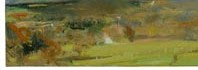
Besides slight value or color changes, another trick is to change the chroma of the color—but not the value. Below are two excerpts I have stolen from paintings that demonstrate this effect—both from very successful painters. If you desaturate these samples, you will see that the value changes are very slight, but the variety of colors and chromatic changes are high. For example, the red in the first sample is the nearly the same value of the flesh color underneath--and the green foreground color in the second sample is the same as the reddish-brown behind. This is a good way of bringing interest and adding "space" to a painting without upsetting the tonal relationships.


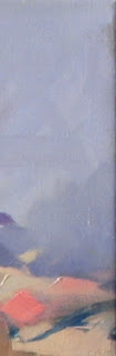
So there you go. Some thoughts on how you might go about improving your paintings, but also how you might improve your strategy to manage color—within a painting process. Hope it is useful, I am sure there are a lot of other ways to go about it. But, these are my thoughts—for what they are worth.

All the best, sixtyminuteartist.

Saturday, October 27, 2007

How to Make Inexpensive Painting Panels

"Hostess Cupcakes (Chocolate)", Oil on Panel, 6x6 inches
Jerry Lebo, 2007

You may have noticed that I have been painting a lot of small paintings on 6x6 panels lately. In fact, I think I am getting a bit addicted to this size. It lends itself well to small still life and landscape work--and it is the type of painting that I recommend you work with if you are just starting out painting, or need to get warmed up. It usually takes me 3-5 hours to finish one of these small paintings--but it can take longer. In the case of "Hostess Cupcakes (Chocolate)" I struggled for quite a while over three days, and finally finished it last night. It may be the last of my "Bite Me" series, as I think I am ready for a new challenge. Although, I don't think it is the end of the 6x6 inch format--so I thought I would show you how I make the panels I use for these types of paintings.

Let me start with a disclaimer. There are a lot of way to make art panels--and I think I have tried most of them over the years. Just go to the art store and you will see all the various technologies. In my mind (and I do not make any money for saying it), SourceTek makes the best panels on the market today. They also happen to be the most expensive--a 6x6 is around $10. If you are selling your paintings for $100--then this is simply not affordable. On the other hand, if you sell you paintings for $1000--or even $300--then you might want to try these. The panels I use cost around $0.35 each to make.

The process starts with a 24x36 sheet of 3/16" tempered Masonite. I buy mine at Home Depot, but I am sure they have this stuff at most hardware stores. Technically, this size is a half sheet--as most places will typically sell it in larger full sheets. There are also different thicknesses--but for small panels there is not much reason to buy it thicker--it just makes the panels heavier. I have used 3/16" masonite for up to 12x12 inch panels. If you want to paint large format paintings on Masonite, there are two problems. First the cost goes up rapidly, and thus canvas becomes more cost-effective. Second, the gesso will warp the sheets as it dries if the panel is large (a problem that can be overcome by using thicker sheets or combining several sheets with glue). In any case, I recommend you use 3/16" mainly for smaller paintings.

I know there are artists who will only paint on panels, even in large sizes. If you want to read more, there is an article in this month's "American Artist, Oil Painting Highlights" magazine titled, "Ask the Right Questions about Hardboard". The artist paints in sizes as large as 30"x40" on Masonite, and recommends that artists use premium untempered, wet/dry process boards. You'll have to read the article to get the details, but I was not clear after reading it why these are preferred--but I think it makes a difference in larger formats. The process is quite elaborate to make such panels.


Anyway, here is the sheet of Masonite ready to go. You will need a good t-square and pencil or marker to get started. It is important to measure very carefully when making small panels, since a little error will make a big difference in the final panel. You can never get it perfect, but you mainly want to make sure the panel is square--if it is not, you should not use it.


Here I was planning only to make eight panels, so I have marked out two lines 6 inches from one end. I then come across and mark three lines 6 inches across down the other side. Use the edge and t-square to make sure you are square to the edges and the panels will be square. If you want to check if they are square--measure the diagonal across each panel--it should be the same distance from opposite corners. If not, the panel is not square--and you need to re-measure (that is why you might want to use a pencil).

Here is what it looks like ready to cut.

And, here is my magic cutting device--a circular saw I bought at Sears a couple of years ago on sale. It cost around $25 and comes in very handy. If you have access to a table saw, I would highly recommend you use it instead of any handheld saw to cut your panels. It is much more accurate. But, if you are careful, a circular saw works just fine. I have also tried a jigsaw and handsaw, neither of which I recommend. For some reason a jigsaw and/or handsaw do not work very well for me--as they tend to create small variations in the edge quality and is easy to get off-line.


So there they are, eight freshly cut panels. The next step is important--sanding the edges and surface. I don't think it matters what type of sandpaper you use--both a medium or fine weight works just fine. I start by sanding the edges to remove all the loose and hanging pieces--then I put a very light sanding on the tempered side of the board (the smooth side), which is the side to which I will be applying gesso. Below is a picture of the pre-sanded and sanded panels. On the left below is a pre-sanded panel, and on the right is a panel after sanding and ready for gesso. The difference should be apparent.


I like to use acrylic gesso, which I apply with a sponge or regular brush. You can use oil-based gesso, but it takes several days to dry--and I do not see much advantage. You use oil paints (or acrylic) on an acrylic gesso--and it dries fast--so why use oil? One word of caution however, gesso is very hard to get off your hands, so I recommend latex gloves or a wet paper towel to clean up quickly.


I start by applying a small bit to the center of the panel and working out from there. If you get too much on the panel, either move it over to the next panel--or simply wipe the brush on the newspaper--which you should definitely put down to protect whatever you are painting on. gesso is very hard to get off of any surface!


After putting a single coat on all panels, I wait 5-10 minutes and come back and put a second coat on each. I think you can probably get away with a single coat, but the brush marks tend to be strong-and a second coat makes a much smoother surface. In fact, if you like a very smooth surface, let the second coat dry a couple of hours--and apply more coats until you are happy. The first coat will dry quickly (1/2 hour), but subsequent coats will take 1-2 hours each.


So there you go, eight fresh panels read for painting. You will need to wait a minimum of 1-2 hours before painting on the panels--but preferably overnight. Clean up any excess that is on the edges, since this will be difficult to remove later. Also, you might want to shift the panels on the newspaper a bit, otherwise they may stick after drying.

So, how much does it costs? The sheet of masonite costs around $8, the gesso around $7 per bottle, and the rest is nominal--assuming you have a t-square and saw. Even if you don't, it might be worth the investment. I can make 20 panels from a sheet of Masonite, and the gesso last for about five sheets. So these panels end up costing around $0.35 each. A bit cheaper than the store bought version. I started making these types of panels several years ago after noticing that Artisan, the art store I haunt when I am in Santa Fe, NM, sells the pre-cut Masonite in their store. It proved to be quick and inexpensive for small paintings. You may find pre-cut panels at your own art store. The price at Artisan is around $1.20 per 6x6 panel--so it is a bit more expensive to buy them pre-cut--but also a bit faster.

Hope you find that useful. Now you cannot complain you have nothing to paint on. You can make these panels quickly and easily in your own studio--for little cost. I like to make various sizes and have them ready. There is nothing I hate more than being ready to paint and not having anything at hand. Yes, you can always stretch a canvas or go buy a ready made panel or canvas from the art store. But, by the time you go there and back, I can make eight panels in my garage--and be painting in the studio. So buy some gesso and Masonite and have it ready in your garage--it is a time saver.

So, there you go. No excuses. Make a small panel and go to your studio and start painting.

All the best, sixtyminuteartist.


Nat had made some comments on tempered vs. un-tempered hardboard--which I wanted to follow up on. I found this link (story of hardboard) which gives a good technical overview (which even I can understand) on hardboards. Bottom line, tempered is okay.

Tuesday, October 23, 2007

Commissions--Where to start?

"Two Dogs", Oil on Panel, 6x6 Inches
Jerry Lebo, 2007

"Hot Dogs" is the commission I mentioned in my last posting. It is a bit different from "Running Dog"--but right up my alley--junk food. And it is headed to this private museum in California.

So, let's say you get a commission to do a painting or piece of art--maybe a portrait or landscape--where do you start? If you are so lucky to be in this situation (which I was the last week)--don't get too excited. There is a lot to keep in mind, from how to negotiate the price, how to get started, and what to do after the painting is finished. As this situation just happened to me, I thought I would pass on the lessons I learned doing commissions over the years-- including most recently with "Two Dogs".

First, let me tell you a bit about my latest experience. I received a rather cryptic email from a guy calling himself "Uncle Frank" (signs his emails "with relish") saying in so many words, "Paint me a hot dog". This is not the first time I have had such cryptic requests. I remember one time painting on the side of the road about ten years ago, working on a landscape, and a woman stopped by to chat. Out of the blue, in the middle of the conversation, she said "Would you paint my horse". Whoa (pun intended), that took me a bit by surprise and I blurted out something like, "I don't really do pet portraits". She stood around nervously for a few minutes and left. After A few minutes I realized that I was a total idiot. Here I was painting a landscape that no one was probably ever going to buy (in fact, that one went in the trash), and I had just had a request for a paying commission. What is wrong with that picture--for a start, a struggling artist turning down money!

Anyway, back to Uncle Frank. Having learned from the past, I quickly shot a price back to him and he agreed--and sent the money through Paypal right away. No guidance or requirements, just paint me a hot dog. So there I was, cash in hand, a pre-sold painting, with full freedom and subject matter that appealed to me. If you are an artist, other than selling everything you paint (which few of us do), this is a good position to be in--or so you might think. But, in fact, commissions can be quite troublesome, so let me give you my experience and how not to repeat some of my mistakes I have made in the past:

1. Calm Down. The adrenaline rush of someone asking for your art before it is even made is pretty heady stuff. You can make a lot of early mistakes just from the nervous energy. For example, if you are like me, a million images will poor through your mind about this yet to be created painting. What a masterpiece it will be! You want to start right away--and stay up all night creating this special commission. My advice in fact is to do nothing and not even to think about what you are going to do for at least 24 hours. Give yourself some space to digest it. If it is a portrait don't rush over to the sitter's house right away and start taking photos and setting up dates for a sitting. If it is a landscape, don't run outside and start painting in the first field you see--or tell your wife you need to run out for some milk and come back in 5 hours. In my experience, such urges will lead to bad paintings pretty quickly. Relax, it is money in the Bank--take it easy.

2. Get Paid. Ask for some portion (or all) of the money up front. I personally would not take a commission without at least 50% up front (or a signed contract). If the person is serious, they will understand and pay. In fact, most will pay entirely up front if asked. However, a word of caution, don't spend the money until you deliver! There is always a risk you will get sick, be forced to delay the project, or simply fail to deliver--in which case you will need to refund the full amount. So, my advice is not to spend any of the funds until you deliver. It is a good incentive, in any case, to know that you will not get paid until the painting is in the hands of the collector--use it as motivation. Also, use your standard pricing for the size requested, but also charge a set-up fee. Don't try to inflate your prices, use what the market has been paying for your pieces. I currently have a standard price of $3 per square inch--so I start with that. As for the setup fee, I just made this mistake, so I advise you not to make the same. There are all sorts of costs associated with a commission that you will not otherwise occur. Travel, photos, setup, time, etc., and these should be paid for as part of the commission. If is a portrait these can be high, so I especially recommend you charge at least 10-20% on top of your usual prices (or at least a flat fee) for any kind of portraiture. In the case of "two dogs" I forgot to charge a setup fee--and ended up paying for gas, a trip to the store, hot dogs, buns, setup time. It adds up--it probably cost me $20, which is a lot for a small painting. Finally, if the value of the commission is more than you usually make in a month--prepare a legal contract document. I know of a case where an organization is commissioning a portrait of its former head at the price of $25,000. Would you take such a commission without a signed contract? I wouldn't--and I think that the organization will insist on such a thing in any case. If it is a private client, you should prepare a contract--and can probably use available templates out there in books or the Internet.

3. Paint what you know. For commissions, the initial inclination may be to try something new. I mean, the piece is sold already--why not take a chance. Resist this temptation. First, because it is time consuming. Second, the commission came based on what someone liked about your past work--not your work 10 years down the road. So, I recommend you take a step back, think about what you have been doing and painting over the last few months--and figure out how to build on those efforts. You are not going to make a sudden leap in style or ability just because you have a commission. Think about how to paint to your strengths and what you have done successfully recently and how you can build on making a successful painting from there. The fact is that if you have not painted a portrait recently, or a landscape, you are not going to suddenly be able to rattle off a great painting. You may need to do some preparatory studies to get ready(another reason for a setup fee). In the case of "Two Dogs", I simply went back to the core work I have been doing as part of my "Bite Me" series--and took the same tack. The objective I set for myself was to apply what I had learned in the early series paintings--but to do something slightly new (note: not totally new). Don't try to do too much or rush through it, just because it is a commission.

4. Deliver on Expectations. Commissions are special pieces. People who commission pieces clearly like your work, and you want to deliver something they will like. In this regard, I would recommend you take the steps to make the process special and professional. For example, I typically include the framing costs as part of the fee. I want my buyers to receive a framed piece. If they do not like your frames, agree to help them pick one out that they like (at their costs). Make sure the painting is delivered framed to the client--ready to hang. This is important--you don't want your painting sitting around waiting to be framed--it could take months. Second, do something a little personal in the commission for the buyer. In the case of "Hot Dogs", it is clear the buyer is a flamboyant kind of guy who celebrates the hot dog as a great American icon. I appreciate that, and wanted to do something he would enjoy. During my 24hr "calm down" period, it came to me that I could go with a "red, white, and blue" variation on my "Bite Me" theme. The hot dogs are red, so I went with an off white and blue background--which gives the painting a nice "Fourth of July" feel. It is like an American Flag with two hot dogs on it.

5. Follow-up. This is true for all people who buy your art. Collectors are your most important client base. They provide free word-of-mouth marketing for your work, and they may buy another piece later on. They are probably more enthused about your work than your own parents--who probably wished you were a lawyer or doctor. Treat a person who commissions a piece as an important collector--and keep them up to date with your work and shows. They will enjoy hearing what is going on with your art career, as they have already made an investment in you. In fact, if they see you are getting successful, they may come back and buy another piece--before the prices get too high! They can also say they knew you when...

So, there you go. Some ideas that you might want to keep in mind on your next commission. As for "Two Dogs", in will shortly be in the collection of the Hot Dog Hall of Fame (a private CA museum, for purposes of the resume)--and who knows after than? Uncle Frank has been trying to find a permanent home for his collection for some time. If he gets the Smithsonian to take it off his hands, then yours truly will have a painting in the Smithsonian--and possibly someday in the far future the 135th President may ask for it to be hung in the oval office! And, even if this doesn't happen, at least I know that the painting will have a good home with Uncle Frank--a step better than the floor of my studio.

So, my advice is to never turn down a commission--unless you simply do not have the time. You never know where it will take you--and the money can be used for food or paint in the meantime.

All the best, sixtyminuteartist

Saturday, October 20, 2007

Improve your Tonal Control

"Running Dog (Study)", Mixed Media on Paper
Jerry Lebo, 2007


Okay, I am getting the feeling that my last two posts did not go over too well--especially the last one. So, I am going to get back to my "bread and butter", which is to focus on making helpful suggestions on studio practices.

Most artist who are just starting out with painting--and even those that have been painting for years--can easily mistake the chroma (intensity) of a color for its tone. Another common mistake is to paint at the extremes, i.e., make all your light tones very high, and your dark tones too dark. Another common problem is to paint in too narrow of a tonal range--that is to paint with virtually the same tone and only vary the color. All these problems related back to the same problem, lack of tonal control.

One common mistake I see artist making in their paintings is to think the higher the intensity of color, the higher the tone. For example, I see a lot of beginning artist look at a tree and want to increase the amount or strength of (or add a lot of white or yellow to) the green used to suggest a highlight (where the light strikes the tree). The result is usually not only a tree that isn't really convincing--but also distracts the viewer. This happens because, without the proper tonal relationship, the tree will not have a convincing sense of mass or relate properly to the things around it. In my experience, it is the relationship of tones in a painting that is more important than color. For example, a tree painted completely in black and white, but with the proper tones, is much more satisfying than a tree painted in all sorts of colors but lacking proper tonal control.

Take, for example, the above drawing, which I have selected as an example of why tone is more important than color. "Running Dog" was a drawing I did in preparation for a painting I did over the summer of our family dog chasing a Frisbee. I deliberately limited the palette in this drawing since I wanted mainly to see if I could draw a convincing picture of a dog running with a Frisbee in its mouth. I did this almost entirely by proper placement and control of relative tones. In fact, there is virtually no color in the drawing, except for the fact that I accidentally got some ultramarine blue into the drawing as I was finishing it. Even then, however, the resulting blue marks work because of the fact that the tone is correct, not the color itself. In fact, the Frisbee was red--but does the viewer know or care about what color the Frisbee is? Also, have you ever seen a dog with blue fur? What matters is that the tones are correct.

Here is another example. I posted a picture the other day of "two pears". People seemed to like the painting--and many commented on the color and expressiveness of the painting. But, in fact, in my mind, the best aspect of this painting is the high level of tonal control I achieved. Don't believe me, check out the painting in black and white--it is still a convincing image of two pears.


As I have said many times in my blog, if a painting does not work in black and white, it will not work in color. Color provides mood, but tone makes a painting convincing. Okay, so how do you go about improving your tonal control while painting. Here are a few ideas that I have developed over the years:

1. Limit your Palette. I went through a phase early in my painting career where I stopped using color at all--or would start all my paintings as monochromatic under-paintings to make sure I got the tones correct. If you go back in my postings to the demonstration I did in July of the "Yellow Cup", you will see this process described. Basically, you get the tones right before introducing any color into the painting--and then finish the painting by slowly introducing color. An alternative is simply paint with 2-3 colors, such as burnt sienna, white, and ultramarine blue. If you can't make an interesting painting with these three colors, you will not be able to do it with more.

2. Make a Tonal Reference Chart. I still keep a 9 tone scale taped to my easel to use when mixing paint. Essentially, to make the scale, I took black and white and made various gradings of pure tone (moving from white to black on each end) on a strip of old canvas. When I am in doubt about which tone to use, or if I have mixed the right tone on the palette or canvas, I will compare it to this scale. I also use it when mixing colors before painting to make sure the color I am mixing is in the right tone. For example, if I know that there is a two or three tone difference between two colors in a painting (perhaps between the trees and the ground plane, for example) I will mix the colors and reference them against scale to make sure that I have not made them too far apart or too close in tone.

3. Mix tone first, then color. Tone is more important than color--and most artist's paints sold these days have enough pigment to change a color very quickly in the direction needed. So my advice is to make sure the tone is correct first, then add the colors to get to where you want to go. For instance, if you want to mix a green, start by mixing equal parts of a green and red (two complements) together until you get a middle tone (check it against your scale), then add a bit of white or ultramarine blue to move toward the right tone (it will look dark brown or light brown depending on which you add). When you have the right tone--add green to the mixture until it gets to the intensity you want. If you feel you have to add a lot of green to get the intensity up--you probably did not have the right tone in the first place. If the tone is right, adding just a touch of green should get you a the right color. Another way to do this I also described in an earlier post--which is to buy neutral chromatic paints premixed--and then add color to them. For example, use Holbein Monochromatic Colors (they come in three neutral graded tones).

4. Pre-mixed Colors and Tones. I know there are some who will argue against this approach, but I like to mix most of the colors I need before I start painting. I usually adjust these a bit as I paint--but if the tones and color are in the right range, these adjustments are usually minor. I showed you how to premix a palette for a landscape painting in a previous post. But, for instance in the "two pears" painting, I -pre-mixed the foreground color, background color, the shadow color on the foreground plane, the mid-tone for the pears, shadow color for the pears, and then the highlight and accent colors (where the light hits the pears, and the darkest shadow and stems). Once I had these colors all mixed, painting was much easier and I could make minor adjustments along the way. Pre-mixing, for me, is a good way to ensure the tones will work together and relative to one another. You can take a black and white picture of your palette or use your tonal reference guide to check that the tones are correct. If the tones are not clear in your subject matter (a still life or landscape you are trying to paint), take a black and white digital picture and keep it next to the easel for reference. You can compare the tones in your painting to those in the reference photo, with the color removed.

5. Use a Camera or Video. I mentioned this the other day in my posting on "seeing your work more objectively". The same process would apply. Periodically, take black and white photos of your painting with a digital camera or video camera and check your tonal range and control. If it doesn’t look right in black and white, it will not work in color.

Okay, there you go. Some tips to assist your painting over the weekend. Hope you find them useful.

I am proud to let you know that I have been commissioned to do a painting that will be included in a national Hall of Fame museum (which one I will not yet say). Stay tuned, in my next posting I will tell you which Museum and will reveal the painting. You will relish it (pun intended).

All the best, Sixtyminuteartist.

Monday, October 15, 2007

Are you an Old Master or Young Genius?

"Hostess Cupcakes (Yellow)", Oil On Panel, 6x6 inches
Jerry Lebo, 2007


"I seek in Painting"--Paul Cezanne


Many people seemed to like my "Ho-Hos" painting--thanks to all who sent comments. I will be starting a blog link trading system, as it appears everybody seems to want to exchange blog links. Stay tuned, I will try to get it up over the weekend. Once it is up and running, I will be happy to cross-link with those who are interested.

Well, if you're into junk food, then you must have eaten Hostess Cupcakes at some point. I found out during my latest visit to the 7-Eleven that these little babies come in a new orange flavor (yellow frosting), which I had never tasted until I took a bite out of the one above. I have to say that I prefer the Chocolate version, however, I did enjoy painting the Yellow ones. I hope you like them as well--if you like them enough, I have put them up on Ebay for sale for a starting price of $99. Click here to bid.

Okay, so back to the theme of the post, "Are you an Old Master or Young Genius"? The idea for this posting comes from a book from David W. Galenson (see reference at bottom), where he presents an interesting hypothesis, namely, that there are basically two types of artists in the world; Those that do their best work early in their life (young geniuses), and those that do not achieve greatness until late in life (old masters).

So how do you tell which on you are? According to Galenson, it is by looking at your underlying motivation for making art. In the first type of artist (old master) the motivation for making art is aesthetic, that is, trying to make something beautiful (that's me, for sure). For the other type of artist (young genius) the motivation is concept, that is to make a piece of art that says something new. The artist motivated by aesthetics is primarily interested in presenting visual perceptions or sensations to the viewer as a means of communicating his/her own artistic goals, while the conceptual artist has the desire to communicate specific ideas or emotions.

The book goes on to describe the typical working mode of each artistic type as follows:

1. The "Aesthetically Motivated" Artist. "Their goals are imprecise, so their product is tentative and incremental. The imprecision of their goals means that these artists rarely feel they have succeeded, and their careers are consequently often dominated by the pursuit of a single objective...Each work leads to the next and none is generally privileged about others...[These] artist build their skills gradually over the course of their careers, improving their work slowly over long periods. These artists are perfectionists and are typically plagued by frustration at their inability to achieve their goals."

2. The "Conceptually Motivated" Artist. "[They] have been motivated by the desire to communicate specific ideas or emotions. Their goals for a particular work can usually be stated precisely, before its production, either as a desired image or as a desired process for the work's execution. Conceptual artists often make detailed preparatory sketches or plans for their paintings. Their execution of their paintings is often systematic, since they may think of it as primarily making a preconceived image...Because it is the idea that is the contribution, conceptual innovations...[and] are often embodies in individual breakthrough works that become recognized as the first statement of innovation."

Galenson then goes onto to describe various artists working styles and connects breakthrough and productivity of various artists back to their age--mainly by looking at Cezanne and Picasso--but also other post-WWII artists, such as De Kooning and Frank Stella, among others.

I have to say I found this book a very interesting read. However, since most of the book spends nearly 190 pages trying to convince you of the hypothesis, if you don't like the premise from the beginning the book can get pretty dull. It is not light reading, it is more of an empirical study of various artists to see if the hypothesis is born out in the data. Just to give you a few tidbits:

1. The price peak for Picasso's art during his lifetime was in his late 20s and early 30s, while for Cezanne it was at two points, in his mid-forties and then up again even higher in his mid-sixties.

2. The number of textbook illustrations (a proxy for number of citations) shows that Pissarro, Degas, Kandinsky, Dubuffet, and O'Keeffe all hit their peak in mid- to late-forties--while Munch, Derain, Braque, Gris, and de Chirico hit their peak in the mid to late twenties.

3. Looking at the age of artist who have paintings in the Museum of Modern Art (MOMA) in New York, Rothko, Gorky, de Kooning, Newman and Pollock painted these works mainly in their late forties and as late as 55 (Rothko), while Lichtenstein, Rauschenberg, Warhol, Johns, and Steel did their work in their 30s and even 20s.

So, there you go. If you are mainly interested in the aesthetics of your art--you are in for a long haul and your best work will come late in life. If you are interested in concepts and expressing emotions--you are most likely to make an early breakthrough (if you make one) and do your best work when you are young.

So, what does this mean for the average artist? First, I think it is useful to know your artistic temperament, so that you know that you are not alone in your artist struggle. If you are an "aesthetically motivated" artist like myself, then you should also now that it is normal to be dissatisfied with your work, grind on your paintings, and to see slow progress. If you are a “conceptually motivated” artist, it is also good to know that you are not alone in your careful planning of your work and need to make a clear conceptual statement—even if the aesthetics are not always pretty. Anyway, I found the book useful and you might want to get a copy. Here is a link on Amazon.

So that is it for today, all the best. Sixtyminuteartist.

The full citation for the book is: Galenson, David W. "Old Masters and Young Geniuses: The Two Life Cycles of Artistic Creativity". Princeton University Press. 2006.

How to be a Successful Artist

"Ho-Hos", Oil on Panel, 6x6 inches
Jerry Lebo, 2007


On Friday, I was driving by the 7-Eleven and could not resist a quick stop for a fix of Ho-Hos and a pair of Hostess Cupcakes. So, I am back on the junk food. I was surprised to see that Ho-Hos now come in packs of three (I recall buying them two per package). Anyway, it just means I had to eat one before I started painting the other two. They taste as I remember--but I soon discovered they melt quickly under a still life lamp. Anyway, it looks like the "Bite Me" series is not over--you can expect another few paintings in this series to come over the next few weeks.

As I lapsed back into my junk food habit, I have been thinking whether it is a good idea to keep painting the same little still life over and over, although I don’t seem to be able to stop myself. I am beginning to feel a bit like Giacometti, who used to make these miniature sculptures and carry them around in a little matchbox in his pocket. They were pretty much impossible to sell, but he said that he could not stop himself from doing it. He tried to make bigger sculptures, but they always seem to shrink until they fit in a matchbox. Fortunately, he eventually got over it and made something that he could actually sell—otherwise we may not have ever heard of him.

Well, this line of thinking made me wonder how one actually becomes a “successful artist”. If you can believe it, there are actually people (mostly economists) who study this topic. They have their own journal and publish all sorts of papers about artists. Anyway, I was looking at some of their work and this is what they are telling us about “successful artists" in the US:

1. The average age of artists in the US is thirty-nine years of age;

2. Art teachers account for less than 1% of artists, down from 5%;

3. “Designers” compose over one-third of all artists;

4. Only one-quarter of artists said they majored in art at the college level;

5. More than 75% of artists have a college education;

6. Ten states account for 60% of the artists in the US;

7. Only 24% of artists reported they worked solely as an artist; and

8. 60% of artists have other jobs, because "they pay better".

So there you go—a bunch a pretty worthless statistics. However, it does show that having a full time job is not unusual for an artist.

If you want to know more about what it takes to be a successful artist I would recommend you read Cay Lang’s book “Taking the Leap”, which puts it more succinctly. I wrote in a previous post about this book some time back. I highly recommend her book if you are interested in good advice on how to build your career--especially if you are just starting out. She says that there are three essential qualities that lead to success as an artist:

1. Curiosity
2. Commitment
3. Good work habits

Of these three, she says "good work habits" are the most important. My own experience bears this out. Since starting this blog, not only has my painting improved, but I feel more in touch with what I am trying to accomplish as an artist--and I have made a few decent paintings in the process.

I hope that helps to inspire you to get back into the studio. A daily practice is the core of all successful artists.

All the best, sixtyminuteartist.

NOTE: The above statistics are taken from Chapter 7, "The Career Matrix: The Pipeline for Arists in the United States" (Authors, A. Gilligan and Neil Alper) which appears in the book, "The Public Life of the Arts in America", edited by Joni. M. Cherbo and Margaret J. Wyszomirski. Rutgers University Press, 2000.

Wednesday, October 10, 2007

Improve your Artistic Vision

" Near Manassas", Oil on Paper
Jerry Lebo, 2005

Thanks to all who have commented recently on my blog. I read all the comments and am grateful for the support. In fact, I try to go to every blog that people send--so keep it up.

Today, I want to write about what I see as one of the biggest problems artist face: how to see their work objectively. I have gotten a lot of comments recently on my blog by people who want me to look at their work and send some comments. As artists, we are often "too close" to our own work to be able to see it clearly--or as others might see it. One of the questions I always ask myself is, "what would I think of my paintings if it they had been made by someone else?" Not always an easy question to answer.

I recall when I was studying at the Washington Studio School, group critiques were always very popular events. People want feedback--and I think this is one way to get outside opinions. But group critiques can only go so far, the artist must make thousands of decisions in the course of making a single painting, so a critique often comes too late--the painting is already done. How many artist go back and repaint a painting as the result of critique? In any case, if you cannot see your work objectively while you are working, you are bound to be making a lot of wrong decisions during the process. How many times, for example, have you finished working on a painting and walked out of the studio--only to come back the next day and say "What was I thinking?!?" A painting can look so good on the way out of the studio, only to look pretty crappy the next day.

The ability to see your work objectively is one of the most important traits for any artist to develop. In fact, I have a theory that this ability is what separates the great artist, from the average, or even above average. I remember reading James Lord's biography of Giacometti. There is a scene where Giacometti is walking out of the studio onto the street and exclaims, "Look at those trees, I don't think I have ever seen those trees looking like that!" At first I was puzzled by this comment, after all he must have looked at those trees many times in the past in all seasons. What was he trying to say? In retrospect, I believe he was reacting to his own artistic vision at the moment, in that, HE really had never seen them like that. That is, at that moment, it was as if he was seeing those trees for the first time, even though he had seen them many times in the past. Imagine the power of being able to look at your work as if you had never seen it before each and every time!

The good news is that most artists are not like Giacometti, but still seem to get along just fine. We struggle to see clearly while we are painting, and even afterwards in judging our own art. If you already have a natural ability to see like Giacometti, I suspect you are not reading this blog because you are too busy getting ready for your museum show. For the rest of us, the good news is there are little tricks and exercises that can improve your ability to see your work more objectively--many of which you may already be using. Here are a few I recommend:

1. Use a Mirror. This is the tried and true method of getting some distance from your work. Put a mirror behind your easel and every so often turn around and look at the reflection of your work in the mirror. Alternatively, you can use two mirrors (one in front at an angle, and one behind--its a bit tricky to get them lined up correctly) and look at your work in the reflection as you paint. I don't know why this works, but it does. Seeing your work in reflection puts some distance between you and the work--it is like standing back from the easel (which you should do frequently anyway) and looking at your painting from across the room. Try it.

2. Paint Upside-Down. I love this one, because it always is a bit freaky. After getting a good start on a painting, so you have the basic composition and masses laid down, turn the painting upside down and look at it--or even paint on it upside down for a while. Sometimes, when things are going very badly in a painting, I turn it upside down and paint on it for 10-20 minutes. In fact, I have finished paintings completely by painting them upside down. No joke. I think this works because it allows you to see the painting more objectively--instead of as individual objects, everything in the painting becomes an abstract element, which allows you to see the balance, composition, tones, and shapes much more objectively.

3. Work on Multiple Paintings at Once. I have discussed this approach in previous postings. Essentially this comes down to switching what you are working on very 10-15 minutes or limiting the time you spend on any one painting. First, if you limit your time, you will make better and bolder decisions. Second, trading out what you are working on regularly gives you a chance to see each painting as if you were just starting on it for the day. One downside of this approach I have found is that you will often reduce the variation of colors and tones in your paintings if you do not take the time to clear your palette before switching out paintings. That is, if you are working from the same mixture of colors on your palette for each painting, there is a risk you will make all your paintings merge toward the same color harmonies. So clean your palette and remix your colors when you change paintings.

4. Take Frequent Studio Breaks. This works very well for me, if I can be disciplined enough to do it. If I simply walk out of my studio door to go upstairs and wash some brushes or get something to drink, when I walk back in the studio I can see my paintings much more clearly. I am often surprised by how different they seem to me after only a few minute break from them. The problem with this approach is that the effect of being able to see clearly, at least for me, only lasts a few minutes--so you have to do it regularly for it to work. In fact, this approach works best if combined with the other methods described here--otherwise you will tire yourself out walking in and out of the studio every 5 minutes.

5. Take Pictures or use a Video Camera. This is an approach I started using a couple of years back as digital photography and video improved, and the cost of the technology came down. I have described how I use digital pictures in previous posts, but this can also work with video cameras. I have in the past set up a video camera connected to a small black and white TV just to the right side of my easel. I point the camera at my easel and watch myself painting both from a distance and in black and white. This is a great way to practice tonal control and composition. If you only have a digital camera, stop every five-ten minutes or so and take a shot of your painting. If your camera has a black and white setting, you can take a picture and look at the tones (you can do this on your computer as well) and see if your tonal range is correct, or if you are too dark or light in certain areas. If your painting does not look good in black and white, it will never look good with color.

So, there are some tips to improve your "artistic vision". Hope you find them useful.

All the best, sixtyminuteartist.

Sunday, October 7, 2007

Painting What You Love

"Maine House (red)", Acrylic on Paper, 17.5x13.5 inches
Jerry Lebo, 2005


Being noted under "Blogs of Note" has brought a lot of attention to my blog. Thanks again to all that have sent comments. There has been a lot of interest in my work as well, so I am going to try to post some more of my work to my website later today. In the meantime, you can see some of my recent work on http://www.sixtyminuteartist.com/ (and pricing information). I have also put a few of my paintings on Ebay for those who would like to purchase through an auction. There is a link below on the bottom right, or simply type "Lebo" on Ebay. My Ebay ID is "mdbear".

I titled this posting "Painting what you Love" partly in response to my 15 minutes of fame on eblogger. My sudden notoriety has got me thinking about why I paint certain things--and why some of my paintings seem to work out better than others. I have been painting long enough to know that I am not always in control of the outcome--and there are many surprises during the process. On the other hand, when I first started painting twenty years ago, I had the feeling that when I finished a painting that went well, I really didn't know why. I think I have a better understanding these days of what works and what doesn't--and here is my thinking.

1. Paint what you see. I have mentioned this in past postings, but I cannot say it enough. Painting requires the artist to be able to see what is there objectively. It is so easy to paint what you think you see. One of my former teachers used to say "look harder". It is good advice. There are a lot of techniques to match the color and tone of what you see, but first you have to see it. A simple example is the sky. Look at the sky every morning for one week. Is it blue? Most beginning painters will always paint a sky blue--when it is in fact very often gray. If you go outside and look at the sky right now, it is most likely made up of at least three to four colors and tones. Paint what you see--not what you think is there. Look harder.

2. Paint what you know. Human beings are strange animals. Information gets into them in a variety of ways and often on a subconscious level. The artist can use this to his/her advantage. The easiest way I have found is to paint locally, that is to paint that which is around you. What you know. Trying to paint a picture of France if you have never been there is not going to work—even if you have the best photo in the world. A good painting reflects the fact that the artist has some connection to the subject. Don’t ask me how it works, it just does.

3. Paint what you love. My finally recommendation is to paint what you love. The simplest reason is that your passion will show it your work if you love what you are painting. But, my experience is that the main reason to paint what you love, is that it is easier to do. What I mean is, it is easier to paint what you love because you work hard, look harder, and will spend more time on a subject that attracts you in a deep way. A boring subject is the quickest way to a bad painting. Also, how can you expect the viewer to feel your passion for a subject that you do not feel passion for when painting. Again, I don’t know how it works—but those subjects I have some connection and passion for seem to turn into the best paintings.

So there you have it. Check back to my web-site later to see more of my artwork. In the meantime, if you are an artist, go to your studio and paint. If you are not an artist, and you want to contribute, call an artist you know and send them some words of encouragement, and if you are feeling flush--buy some of their work.

All the best, sixtyminuteartist.

Saturday, October 6, 2007

Blogging as Structure

"Near Zuni", Oil on Canvas, 12x17 inches
Jerry Lebo, 2006

Much to my surprise, this morning I discovered that my blog has been cited under "blogs of note" by eblogger. The result was that my usual 20-30 readers (on a good day) jumped to over 2000 overnight! Thank you for all that have stopped by to take a look. I have recieved a lot of feedback and I appreciate the time people have taken to send their thoughts. I don't blog to get attention, but it is nice to know that people have found my blog useful and inspiring.


So why do I blog? If you want, you can go back and read my first posting and find out. Otherwise, let me go back to reconsider one of the issues I raised in my very first posting--the need for a regular painting practice. I was talking with my friend Mitchell Johnson earlier today and we were talking about my blog, and why I started it in the first place--and an issue that I have been wanting to cover for some time came up, "structure". Painting is a strange thing, you do it alone (mostly) and then stand back and look at what you've done for a while... and then start all over again. It never ends--I suppose until you drop dead.

When I was painting full-time back in the mid-1990s, I remember having a hard time getting myself into the studio many days. There I was, trying to be a full-time artist and not even being able to paint. When I did get into the studio, I often would paint for a few hours and then go off and do something else. So, in effect, being a full-time artist ended up taking about 4-5 hours a day (assuming I painted twice a day). Now I have a full time job, and spend up to 12 hours a day at the office. It doesn't make sense, how can I spend so much time at my desk at a job I don't really want to be doing, but have a hard time spending more than 4-5 hours in the studio?


This dilemma is at the heart of why I started a blog and why I call myself "sixtyminuteartist". One of the key aspects of painting that I think undermines many artist is the complete lack of structure around the process. I mean, it is a wide open field. Blank canvas, plus hundreds of tubes of paint (potentially) and millions of possible combinations...it is a mixture for disaster from the start. And, it is this lack of structure that I think causes many artist to fail.


If you are an artist, the nice thing about starting a blog is that it gives you something on which to structure your practice, particulary your thinking. Most of what I write in my blog are things that I think about during the day or in the studio about art. Ideas that I want to explore or things I have discovered over the years. Remembering these things and writing them down gives me a small bit of structure when I go into the studio. Somewhere to start--something to start with.


In addition to a starting point, my blog forces me to consider my thoughts, my art, and my thinking together as a practice. To see it a bit more objectively as an output. And, it keeps me honest. Whatever paintings I post on my blog, or words that I write, seeing them up on the web for all to see makes me think twice about what I write--and helps me to see my work a bit more objectively--as a reader and viewer.

So, again, thank you to all who have visited and commented on my blog. If you are an artist, I hope you will be inspired to get back in the studio and spend at least 60 minutes a day. Start a blog to mark your progress and keep you thinking about art. Don't do it because you think it will bring you attention or sell paintings--do it for your own practice. The world needs artists--and if you are an artist, you need art.


All the best, sixtyminuteartist


Monday, October 1, 2007

Franz Bader Bookstore Closing--final days 40% sale

"Two Pears", Oil on Panel, 6x6 inches
Jerry Lebo, 2007

I went over to the Franz Bader Bookstore today. I hadn't been there is a while, since I have been traveling. If you recall I posted about its pending closure some time back. See my August blog list or the link below.


Anyway, for the month of September all books were marked 30% off--but I missed this sale due to my travel. In October, the sale has been increase to 40%. I can tell you, the books are going fast out the door at these prices, so I urge you to go over there and see if there is something you want before it is too late. I spent around 1/2 hour over there today and got 5 books for $60. There are still a few worth looking at, but they won't last long. Sabine told me the store will close forever in around 2 weeks, if the books last that long.


That's all for now. Just wanted to alert you to the sale and urgency to get a few art books before they are all gone. Hope you enjoyed the painting as well.


Here is a link to my previous post where there is a map and more info on the Franz Bader Bookstore.


All the best, sixtyminuteartist.