 "Dead Heroes", Polymer on Canvas, 47 x 66 inches
Jerry Lebo, 2008
I have been busy over the last few weeks working on several large paintings, which has proven to be a big challenge. The above painting is the first to come off the easel, and is about as big as I can effectively paint in my basement studio. Here is a shot of what it looked like on the easel, to give you an idea of the scale.
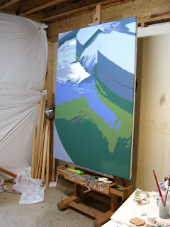
As you can see, I am continuing to pursue the approach I started in the painting of our dog I showed you in my last post. The intent is to push the color harmony ideas I have been talking about over the last few months. That is, to bring together the color interactions in such a way as to make a psychological “color space” which is integral to the subject and message of the painting--and transforms the viewer's experience.
The painting itself is based on a photo I took this summer at the World War II memorial here in DC. I made a photo album for my Great Uncle who recently died—as he was too ill to travel to see the Memorial himself. The picture is of one of the waterfalls that they have at each end of the memorial (one each for the Atlantic and Pacific Campaigns)—this one being the Pacific. My Great Uncle was in the Pacific during WWII—and survived the sinking of his ship and his shipmates being eaten by sharks. I have fond memories of how he used to tell me war stories. He is one of the big influences of my youth—always around during the summers I spent in Indiana as a kid. He died a couple of months back after a long battle with prostate cancer. I will miss him--and I suppose the painting is a bit of a memorial to his memory.
Okay, so back to the subject of the post—painting shadows. This post has been lurking in my mind for a couple of weeks--and is motivated by one of the key issues I see people struggling with in their paintings. Often we stand back from the easel--and wonder what is wrong with a painting and think "color". But, which color? Most of the time we look at the higher value and high chroma hues and start messing around with those--but in fact it may be the shadows that are the problem. Frankly, I see this over and over in my students work--they pay a lot of attention to the colors where the light is hitting an object or the landscape--but then mix up some pretty boring, or even plain bad, shadow colors.
The first message I want to get across is: shadows are colors! Let me say it again another way: the color you are putting in the shadow is just as important as the color you are putting on the highlight. If either one is wrong--the painting will suffer. Okay, so how do you find the right shadow color? Well, first, you need to be able to see the shadow color. So let me give you a little exercise that I have learned that will help developed your mind and eyes to better see shadow colors. If you do this exercise regularly, it will improve your painting. I promise. It is a little exercise I call, "find the shadow color".
The exercise starts by finding a piece of paper that is a single color and at least around four or five inches square in size. It doesn't matter where it comes from--out of a magazine, book cover, or simply paint a piece of paper. Next, take the piece of paper and put it a few feet away from you in a location where it is being hit by light. It can be natural light coming in from a window (if you are in the studio)--or light from a lamp. Doesn't matter. Once you have your color/paper sitting there, take a moment to really notice the color. Take a long look--try to remember what it looks like. Is it warm or cool? What is the hue? Try to memorize the color.
Next, take the same piece of paper and put it somewhere nearby where it is not being hit by light--but the color is still observable (not in the closet!). For example, if you had the paper sitting on a table, put it on the floor next to the table in the shadow of a table. If it was in the light coming in a window, put it in a place where the light is not directly hitting it. Notice the change in color. Take a long look--try to remember what the new color looks like--how did it change when you moved it out of the light? Did it get warmer or cooler? What is the hue? Again, try to memorize the color--and think about how it compares to the color when it was lighted. Move it back and forth between light and shadow and notice what happens.
Okay, now the fun part. Go and find another piece of paper (or paint one) that is the color of the paper when it is not being hit by light. This is a lot harder than it sounds. I did this in my office the other day and it took me a good fifteen minutes to find two objects where the color of one was the shadow color of the other. The test that you have the right color is simple. Put the two pieces of paper in light together, then move the original piece (the one you first chose and observed in light) into the shadow. If you have the right shadow color, the two pieces of paper should appear to be the same color.
Below are some pictures to give you a better idea of how this works. The first photo below is of the two pieces of paper that I determined were shadow and highlight colors. They are actually the covers of two publications I had sitting around my office. This is how they look sitting on my desk as lighted by the lighting in my office.
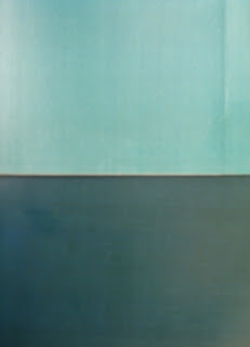
So, how do I know that the darker color is the shadow color of the lighter one? Simple, I put the lighter color on the floor off the edge of my desk so that I could see them next to the other. In effect, so that the darker one was in the light, but the lighter one was in shadow. Below is a photo of the result--taken with the darker one sitting on the desk and the lighter one on the floor in shadow.

You can see that they have effectively become the same color. And, yes, the one on the floor is the lighter color in the above photo. Hard to believe I know.
Try this exercise in various lighting conditions and types of light. Finding two colors that work may be a bit of a struggle at first, but you will get better at it. If you do it as a regular exercise, you may be surprised how it improves your ability to paint shadow colors (the first thing you will notice is that shadows are colors--and they have predictable relationships!). Your mind will remember how colors in shadow and light relate--which will make you quicker at finding the right shadow color.
There are a lot of variations on this exercise that can help you out in the studio. For example, say I was painting a still life with an object in it that I was having a hard time finding the right (or even simply believable) shadow color. A simple guide might be to paint a piece of paper the color I was using for the object in light, and another piece the shadow color I was using. Then I could do the same as I did above to compare the shadow color to othe other paper "in shadow"--and if the relationship was correct. Even if the match was not perfect, I would expect the temperature and general hue would be in the same range. If the two colors are off--you will see it pretty quickly--trust me.
One of the things you will notice right away is that the shadow color of something in natural light is much cooler that a shadow of the same object indoors under normal house lighting. Which means, for example, that the relationships indoors are different than those you would see if you did the same exercise (with the same colors) outdoors. Which means that if you are painting landscapes, use natural lighting for the exercise--and preferably do it outdoors. Also, the shadow color of an object will vary with the distance you are away from it. So, if you move one of the pieces of paper closer or farther away from you--the relationships change. So, think of it as a way to train your eyes and guide your thinking--not a scientific experiment.
So there you go. A simple exercise to help you explore shadow colors--and to get better at seeing. Hope you find it useful.
All the best, sixtyminuteartist.


18 comments:
Glad to see you're back. Another really great exercise to use. Thanks, Judy
Good stuff Jerry. I'm glad you showed the photos of your color samples. Always good to see ideas in action.
That last part about natural vs. artificial light and distance etc. really pulled it all together. It is about training your eyes to see.
Thanks Frank. BTW, I am an avid follower of your blog and enjoy reading it. Great stuff--and you work is always interesting. Jerry
I've noticed when comparing light and shadow colors that the difference is more drastic in bright sunlight, and the colors get more similar as the light source becomes less intense. This is more related to value than color, but it's something to consider when determining color. For example, on a sunny day, the grass in the middle of the lawn might be 5 shades lighter (on my scale) than it is in the shade of a tree. On an overcast day, the value difference might be only 3-4 shades off.
Hi, I have been enjoying your site with it's wealth of info. I have been doing mostly sculpture in the last two years but your site makes me want to get back into the studio!
earth 4 energy -
easy backup wizard -
easy member pro -
easy tv soft -
eatstopeat -
eat stop eat -
error fix -
error killer -
evidence nuker -
fap turbo -
fatburningfurnace -
fat burning furnace -
fatloss4idiots -
fat loss 4 idiots -
final uninstaller -
fitnessmodelprogram -
fitness model program -
flatten your abs -
gamers testing ground -
gov auction -
governmentregistry -
government registry -
gov records -
herbal hair solution -
homebre ware -
home job group -
homemadeenergy -
home made energy -
inteli gator -
joanas world -
joyful tomato -
kidney stone remedy -
learn digital photography now -
learn elements now -
talking to toddlers -
the action machine -
thebadbreathreport -
the bad breath report -
thedietsolutionprogram -
the diet solution program -
the rich jerk -
tonsil stones remedies -
top secret fat loss secret -
turbo cash generator -
turbulence training -
twitter online system -
uncle sams money -
underground hypnosis -
vincedelmontefitness -
vince del monte fitness -
warp speed fat loss -
water 4 gas -
wedding speech 4u -
wp goldmine -
wrap candy -
xsite pro -
zygor guides -
37 days to clean credit -
advanced defrag -
adware alert -
adware bot -
affiliate prophet -
affiliate video brander -
anti spyware -
art of approaching -
atomic blogging -
auction classified cash -
automated cash formula -
Quite helpful piece of writing, thanks so much for your post.
So there you go. A simple exercise to help you explore shadow colors--and to get better at seeing. Hope you find it useful.
black dress pakistani salwar kameez
black and gold salwar kameez
web link you can look here useful reference you could try this out why not look here this page
Wow! love the color combination.
Aqualine Metal Water Tanks
cmdfk239k6v
golden goose outlet
golden goose outlet
golden goose outlet
golden goose outlet
supreme outlet
golden goose outlet
golden goose outlet
golden goose outlet
golden goose outlet
golden goose outlet
Thanks for posting and discussion of the topic finding shadow color, and provide an important information. this is useful article. so it's very good article.
Best laparoscopic surgeon in Patna
Thanks for posting and discussion of the topic Finding the Shadow Color : Sixty Minute Artist, and provide an important information. this is useful article. so it's nice article. I really like this blog.
best gynecologist hospital in patna
Thanks for posting and discussion of the topic Finding the Shadow Color : Sixty Minute Artist, and provide an important information. this is useful article. so it's very good article
laparoscopic appendix surgery in Patna
Thanks for posting and discussion of the topic Finding the Shadow Color : Sixty Minute Artist, and provide an important information. this is useful article. so it's very good article,
Best laparoscopic surgeon in Patna
Thanks for posting and discussion of the topic Finding the Shadow Color : Sixty Minute Artist, and provide an important information. this is useful article. so it's very good article
Kerala Tour and Packages
Thanks for posting and discussion of the topic Finding the Shadow Color : Sixty Minute Artist, and provide an important information. this is useful article. so it's very good article,
gallbladder stone surgery in patna
Post a Comment